I’ve always loved colors and combining old colors to make new ones. I was the kid who wanted the big box of 64 Crayola crayons for Christmas. And I memorized the names of every one of them.
Today, I still enjoy going to the office supply store and buying a bunch of colored pencils, pens, highlighters, and Sharpies. Sometimes, I don’t even use them. I just arrange them on my desk so that I can look at them while I work, sort of like the way other people decorate their work area with family pictures, knickknacks, or those strange little trolls.
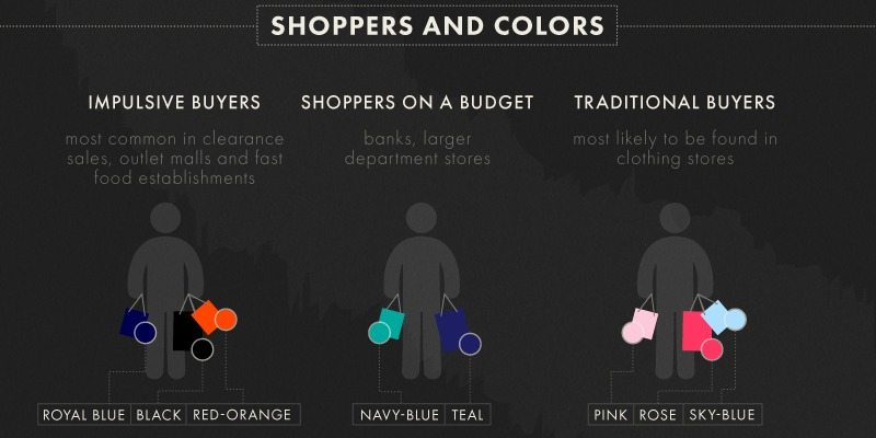
So, it shouldn’t be a surprise that I also love collecting color palettes and studying how assorted colors invoke different feelings and reactions. That’s also why I am so fond of this infographic created by Skilled.
People Really Do Judge A Book By Its Cover
Colors are more than just eye candy – they affect our perception of a brand or product, and they play a big role when we make purchasing decisions. The infographic below does a great job of summarizing the impact of different colors in different situations.
Here are five of my favorite stats from the infographic:
- Color impression is responsible for 60% of the acceptance or rejection of a product.
- For 7% of consumers, color is the main reason why they buy a particular product.
- 52% of shoppers won’t return to a website because of overall aesthetics.
- HubSpot’s red call-to-action button outperformed a green button by 21%, based on 2,000 website visits.
- The average product assessment by buyers takes only 90 seconds.
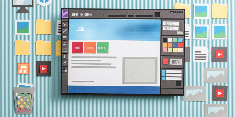
What’s the takeaway here? Next time you’re redesigning your website or refreshing your logo, take some time to do some color research first. Don’t just pick colors that are appealing to you. Consider how your target audience will respond to them.
But don’t disregard your own preferences entirely. You should like your color scheme, too.

Presented by Skilled.co
CEO and Co-Founder of Creative Mindscape. I’m a science fiction junkie, cat lover, and LinkedIn lurker. If you look around my office, you’d also think I collected crumpled paper.


