Although it might strike some as an afterthought during brand development, a well-designed logo is crucial to every business. Your logo is the single most visible graphic representation of your brand.
Not only can it provide instant brand recognition, but when created thoughtfully, it can also provide insight into the products or services you offer as well as your brand’s mission or vision.
What Makes a Good Logo?
An effective logo doesn’t need to be extremely intricate or embellished. More often than not, the simpler the logo the more versatile and notable it will be. An impressive logo will be unique without being overdrawn.
The best logos are memorable, as well. It only takes a glance for you to relate golden arches with McDonalds, the “swish” with Nike or the lowercase blue and white “f” with Facebook.
A quality logo should also have a classic appeal. Nix ideas that are too trendy, as they will quickly begin to seem outdated (and can give potential customers the same idea about your brand). Of course, you can always give your logo an update, but since it should remain recognizable it is best to start with an enduring design.
An adaptable logo allows you to incorporate it across multiple channels and in various applications. A logo in vector format that looks just as good in a single color, in reverse, shrunken super small or expanded exceedingly large will serve you well.
The font, colors, and images you choose should suit your brand, as well. Keeping your brand’s identity and voice in mind when making these selections can go a long way.
Negative Space in Logos
Simply put, negative space is the space surrounding an object in an artistic image. You might not typically put a lot of thought or effort into something that isn’t really there, but this lack of color or design can actually have quite an effect on the appearance of a logo.
Consider the many optical illusions people share on social media asking, “Which do you see, a vase or two faces?” These images use negative space to transform a single graphic into two distinct images.
You can integrate this concept when designing your company’s new logo. If you can create a design that either subliminally or transparently presents an image that somehow conveys your brand’s message, you have a valuable marketing tool.
In addition, a creative logo with a slightly veiled image or message can support your brand’s smart reputation. It can make your audience feel clever, as well, which results in even warmer feelings about your brand.
Examples of Design “Hidden” in Logos
Dozens, if not hundreds, of logos using negative space or other methods in which the design is “hidden” abound. Check out some of these fascinating creations, some of which are sure to surprise you.
A building footprint describes the area of a site used by a building structure, which is defined by the perimeter of the building plan. BuildingFootprintUSA has created a nationwide building footprint GIS data layer for map enhancements and detailed analytics.
Their logo appropriately takes the letters B and F from the business name and transforms it into the appearance of a multidimensional building.
![]()
At first glance, you might think the logo for this spa, which includes wine tasting as part of its luxuriant services, is a simple and sparse forest.
Upon closer look, you will see that the negative space between the trees creates the illusion of wine bottles.

A large tree surrounded by birds, a river and fish is the icon that welcomes you to the Pittsburgh Zoo.
Inspect it a bit more closely, and you will also see a gorilla and a lion facing off in the negative space.

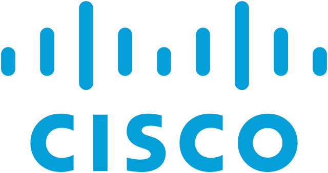
The networking equipment and software manufacturer derived its name from the city of San Francisco.
The brand’s initial logo depicted the shape of the Golden Gate Bridge. It has since evolved into a digital signal, but you can still see the influence of the bridge’s shape in the design.
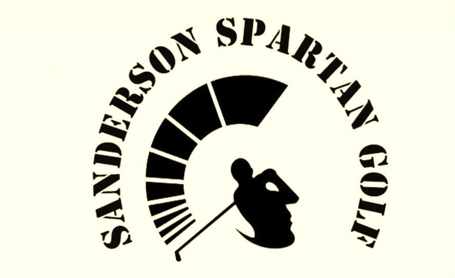
Sanderson Men’s Varsity Golf Team of Raleigh, NC, which is known as Sanderson Spartan Golf, sports the profile of a Spartan soldier… or is it a golfer taking a swing?
One of the largest hypermarket chains in the world, Carrefour is a French multinational retailer whose name translates to mean crossroads.
The red and blue arrows pointing in opposite directions on the logo refer to this meaning, but it also contains a letter C created by the negative space.

This bedding brand uses a simple logo made from its name. The u in Luna is replaced with a slightly tilted crescent moon. Of course, Luna translates into moon and encourages you to sleep all night.
![]()
The mountain biking and road cycling holiday guide has a fitting logo, which turns the A and R from the brand’s name into a cyclist climbing the Alps.

There are logos that are just fine and then there are those that stand out. The difference between a decent logo and one that speaks to your audience may seem slight, but that extra bit of effort, time and tweaking can make a major impact on all of your marketing efforts.

Writer, editor and client advocate specializing in reputation management, content marketing, technology and non-profit topics.